Gradient
This control creates a gradient color selection interface.
<Control type="gradient" name="gradient_name" label="Gradient control" />
Attributes
-
default- Defines the default value of the control.
Type: string -
label- Defines the label of the control which will be displayed in the page builder.
Type: string -
name- Defines the name of the control which will be referenced to render the control value.
Type: string
Rendering the control value
The value can be rendered in a template, style, or script.
In a template, use Get or Loop to render the control value.
<Get control=gradient_name />

<Loop control=gradient_name>
  <ul>
    <li>Value: <Field value/></li>
    <li>Type: <Field type/></li>
    <li>Angle: <Field angle/></li>
    <li>Shape: <Field shape/></li>
    <li>Color: <Field colors/></li>
  </ul>
</Loop>
In a style, use the standard syntax to refer to SASS variables.
.style {
  background-image: $gradient_name;
}
In a script, use the standard syntax to refer to JS variables.
console.log(gradient_name);
Fields
value- Value of the control.type- Type of gradient, either linear, radial, or conical.angle- Angle of the gradient if type is linear.shape- Shape of the gradient if type is radial.colors- Colors in the gradient expressed as a list of RGBA values.
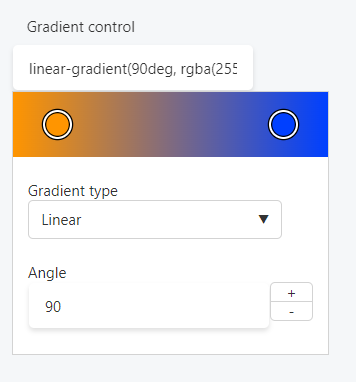
Preview
In Gutenberg
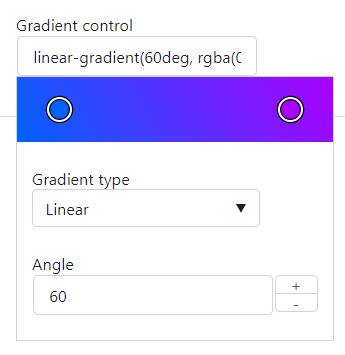
In Elementor
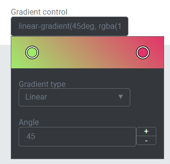
In Beaver Builder