Color Picker
This control creates a color selection interface.
<Control type="color_picker" name="color_picker_name" label="Color picker control" />
Attributes
-
alpha- If true, enables opacity setting
Type: boolean
Default:true -
default- Defines the default value of the control. Accepted values arergb(),rgba(), orhex
Type: string -
label- Defines the label of the control which will be displayed in the page builder.
Type: string -
name- Defines the name of the control which will be referenced to render the control value.
Type: string
Rendering the control value
The value can be rendered in a template, style, or script.
In a template, use Get or Loop to render the control value.
<Get control=color_picker_name />

<Loop control=color_picker_name>
  <Field value />
</Loop>
In a style, use the standard syntax to refer to SASS variables.
.style {
  color: $color_picker_name;
}
In a script, use the standard syntax to refer to JS variables.
console.log(color_picker_name);
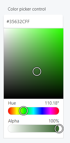
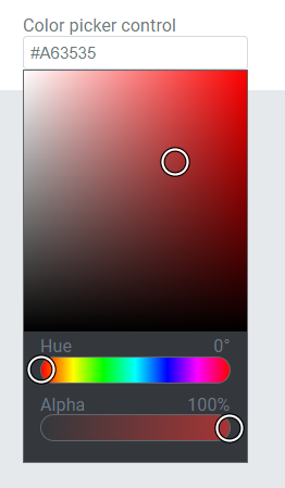
Preview
In Gutenberg

In Elementor
In Beaver Builder