Date Picker
This control creates a date selection interface.
<Control type="date_picker" name="date_picker_name" label="Date picker control" format="d/m/y" />
Attributes
-
default- Defines the default value of the control.
Type: string -
format- Defines the format of the date's value.
Type: string
Default:d/m/Y -
label- Defines the label of the control which will be displayed in the page builder.
Type: string -
name- Defines the name of the control which will be referenced to render the control value.
Type: string
Rendering the control value
The value can be rendered in a template, style, or script.
In a template, use Get or Loop to render the control value.
<Get control=date_picker_name />

<Loop control=date_picker_name>
  <Field value />
</Loop>
For example, you can have a template that is displaying a calendar and you want to highlight a specific date:
<Loop control=date_picker_name>
  <div class="my-date" data-date="{Field value}">
    <Field value />
  </div>
</Loop>
In a style, use the standard syntax to refer to SASS variables.
time[datetime="#{$date_picker_name}"] {
  color: red;
}
In a script, use the standard syntax to refer to JS variables.
console.log(date_picker_name);
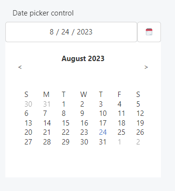
Preview
In Gutenberg
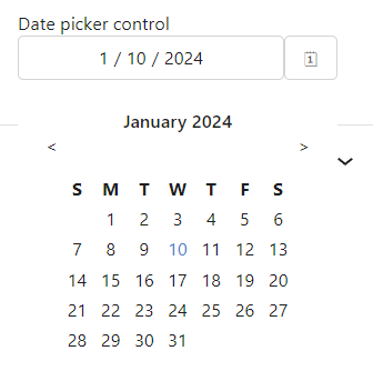
In Elementor
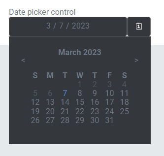
In Beaver Builder