Select
This control creates a select field.
Below is an example of a select control with the ability to select multiple options.
<Control type="select" name="select_name" label="Select control" multiple="true">
  <Map choices>
    <Key one>One</Key>
    <Key two>Two</Key>
    <Key three>Three</Key>
  </Map>
</Control>
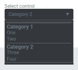
Here is an example of a select control with multiple maps to create a more structured hierarchy.
<Control type="select" name="select_name" label="Select control">
  <List name=choices>
    <Map>
      <Key name>Category 1</Key>
      <Map choices>
        <Key one>One</Key>
        <Key two>Two</Key>
      </Map>
    </Map>
    <Map>
      <Key name>Category 2</Key>
      <Map choices>
        <Key three>Three</Key>
        <Key four>Four</Key>
      </Map>
    </Map>
  </List>
</Control>
Attributes
default- Defines the default value of the control.
Type: stringlabel- Defines the label of the control which will be displayed in the page builder.
Type: stringmultiple- If true, users will be able to select multiple options.
Type: booleanname- Defines the name of the control which will be referenced to render the control value.
Type: stringoptions- Defines the value and label of the options.
Type: map
Rendering the control value
The value can be rendered in a template, style, or script.
In a template, use Get or Loop to render the control value.
<Get control=select_name />

<Loop control=select_name>
  <Field value />
</Loop>
In a style, use the standard syntax to refer to SASS variables. Note that this example works with only one item selected.
.style {
  display: flex;
  justify-content: #{$select_name};
}
In a script, use the standard syntax to refer to JS variables.
console.log(select_name);
Preview
In Gutenberg


In Elementor

In Beaver Builder

